Winter interface refresh
We've been working on some refinements to the Cashboard UI based on our own use and usability testing over the past couple of weeks.
The update just went live on the server a few hours ago, and I wanted to take this opportunity to highlight some of the improvements.
New Dashboard
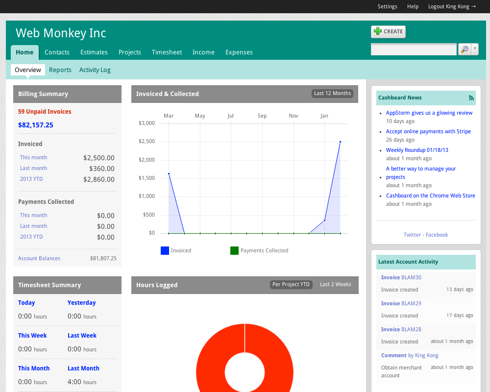
First up, we've removed the Flash-based graphs from the application, and instead replaced them with HTML5 versions. This means you can see them properly on your mobile device.
The graphs, which were previously hidden under the Reports section of the app, have now been brought onto the Overview screen, which you can see below.
We feel this highlights the activity in your account and gives a little more insight into the health of your business than before.
It also breaks up the "three panel" setup we had previously, because we needed to make the home page more configurable for the next feature...
More configurable interface

Cashboard is a powerful software package - so powerful that you might not be ready to use portions of it.
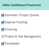
Some of you might just be using the Invoicing section of the app, while others use the full package. Instead of forcing you to look at sections of the app you're not using we've implemented some preferences that allow you to turn those features off.
To do so, navigate to the Settings > Preferences section of the app. Look under the section titled Hide Cashboard Features, and simply uncheck the features you don't want.
Hiding features here will also hide them from the dashboard, your client's UI, and from the Create menu. You can toggle them on or off at any time.
Other minor updates
We've also updated smaller parts of the app's design which deserve mentioning.
Responsive CSS for the client interface
Your clients will now see screens sized to their device - great if they're trying to pay your invoice from a smartphone. We're using the excellent Zurb Foundation CSS framework to power our responsive design, and for our grid-based CSS layout.
Improved button bar placement
We've moved our edit button bars towards the top of your browser instead of tucking them away near the bottom of the screen. After some testing we noticed that customers were having a difficult time seeing them on larger monitors.
Crisper font rendering
We've taken some special CSS rendering tips to make fonts appear even more crisp than before.
As always I believe we've caught all of the rough edges for this release - but please definitely let us know if you're seeing any weird display bugs over the next week or so.
comments powered by Disqus


